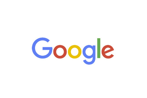
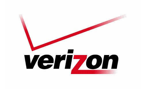
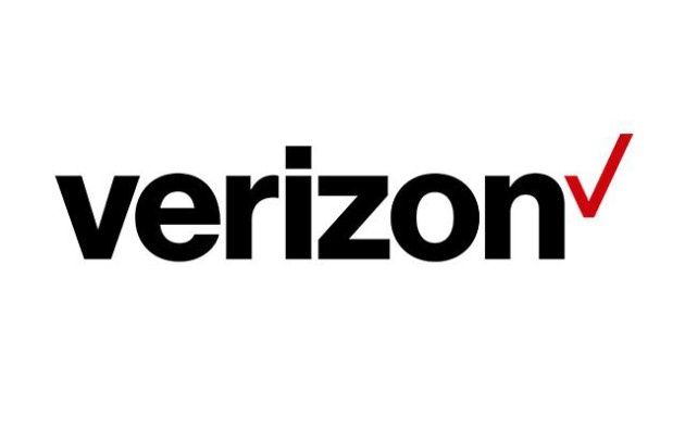
So I am sure you’ve heard it. On Tuesday, Google unveiled its new logo and one day later Verizon showcased theirs. Big news by the way: two multi-billion dollar companies that haven’t change their logos in 16 and 15 years respectively are now telling a new story with their brand. With this change, re-branding comes into play and a good marketing strategy always has a story behind it, always keeping the consumer in mind. And of course, Google and Verizon have the perfect story behind their re-branding that gets us wondering, did they do this on purpose? We all know that logos are taking a turn toward the simplistic but now we can see more of the Fortune 500 companies finally breaking out that long awaited logo redesign after two famous logos headed the way.

So, how did they do it? What is their story and do we see success? Google’s old logo did not receive much criticism but they changed it to a simpler, animated and almost child-like chalk drawing, they eliminated the back drop and computer generated feel, really just a typeface change. What did they say about this unexpected change? “We’re introducing a new logo and identity family that reflects this reality and shows you when the Google magic is working for you, even on the tiniest screens,” Google said in a blog post on Sept. 1.
So, we are not surprised that Google made this change based on a more internet savvy and technologically advanced consumer that goes to their tablet or smartphone to peruse the internet. As algorithms change and SEO is significantly affected by those without mobile friendly sites, we can all take a hint from this change and follow suit, if only purely to keep our online presence, present. This logo change comes dangerously close to the August restructuring of Google, just as the company split off a new division, Alphabet to head the corporation.
Verizon, on the other hand has received a lot of criticism from designers and consumers alike about their trademark logo having two focal points, the red check and the red z in the Verizon type face. With obnoxious co-branding with the Galaxy Note and a mess of masculine red and black colors, Verizon’s Chief Marketing Officer, Diego Scotti explains the need for the new look, “Our goal was to define a brand identity that stands for simplicity, honesty and even joy, in a category that has become overrun by confusion, disclaimers and frustration.” And I think we can all agree with him on that last point.


As these two companies are driven by simplicity and consistency throughout all platforms. The new logo changes support a notion of reliability and consumers can expect to see these logos used a lot more effectively on mobile phones and tablets. I think we can all learn something from these two companies: mobility is the future. And since Google is such a staple in the success of businesses across the globe, I think it’s safe to say we can predict this steady change for the digital age in the coming years.
What do you think of these new logos? Which company will be next to reveal their new re-branding strategy?
Need a new logo? Help with re-branding? We can help. We have loads of talent with our designers boasting over 25 year's experience. We know the trends and have the eye, so let's propel your business forward!
Get Social With Us! Like Us on Facebook and follow us on Twitter and LinkedIn for more