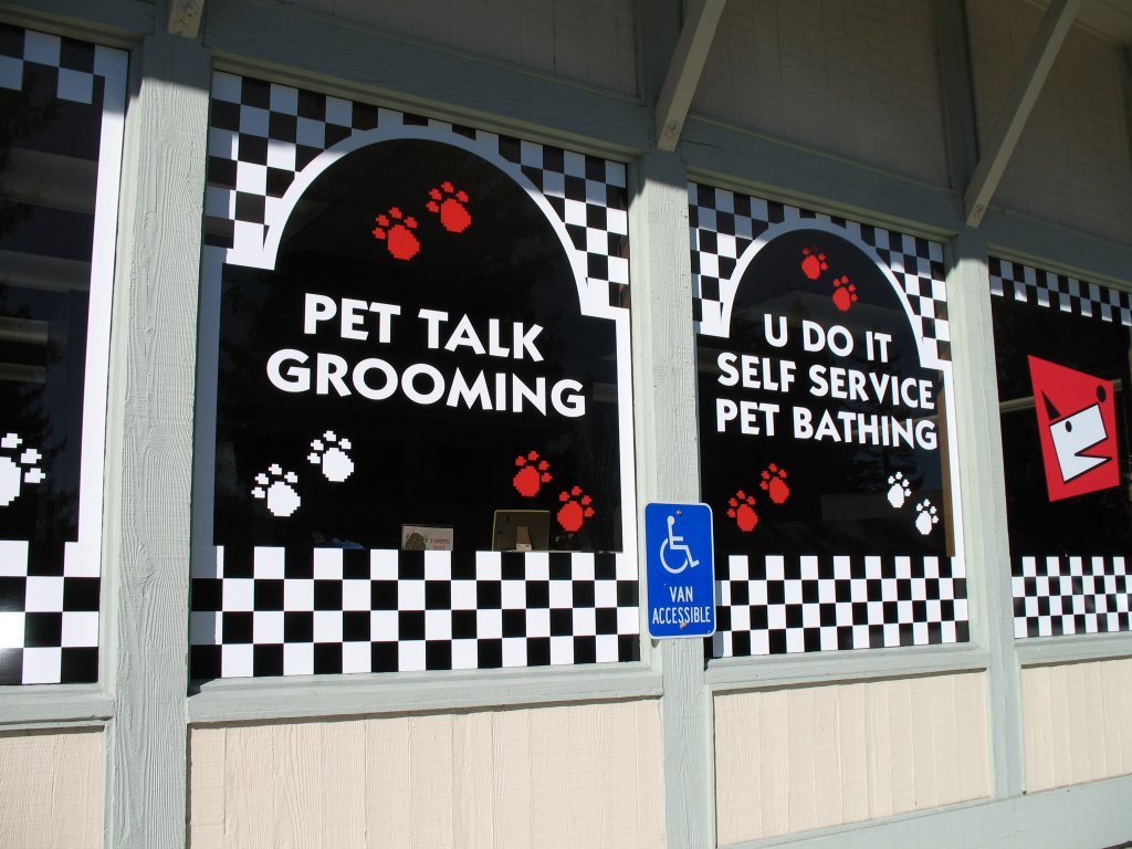
Recently, we experienced some confusion from a business owner on where they should place their window graphics for best viewing. In order to be best seen by their customers and so they can be best seen from the street. Our advice was simple but effective. When installing graphics you want to make sure you are taking these following five steps.
1. Use LARGE, CLEAR fonts
Some want to use the same font they use with their logo but that can be a fancy brush script that is difficult to read from far away or when you are passing in a car. So make sure you are using A BOLD AND EASY TO READ font like Ariel Black. Although it may not be consistent with your brand, it will do a better job of getting people into the door.

2. Use simple, concise wording
Don’t put your whole company history on the side of the building (although a nice touch) it isn’t something that will be easily visible to people walking or driving by. A lot of our customers put their logo, name and phone number on the side of the building, or if they have happy hour they list those times and details. Figure out what you want and trim it down to under one sentence.
3. Place graphic at waist to eye level
Putting a graphic too low or too high can result in a missed branding opportunity, so make sure your graphics appear where the customer can see, either walking up from a distance or once they reach the door without having to twist, lift or lower their gaze. Also, make sure the graphics appear in an area where people will see them first (we know it sounds obvious but many make the mistake). When placing on a door place on the left door, so customers walking through the right will look at that graphic directly when entering.
4. Use contrasting colors
If your business is white please do not request cream color graphics. We see it all too often and when ordering with us we always make sure you get the best product (and color for that matter), but unfortunately some window graphics blend in with the window, defeating the window graphics' entire purpose. Make sure to use bright and contrasting colors so they can see you from a mile away.

5. Go to a quality printer that uses high quality vinyl
Window graphics, more often than not, are placed by a professional with high quality vinyl. If not, they tend to fade, bubble, and crack and/or fall off. Although, over the years some of these things occur if they are not properly handled but they could occur sooner and with complimenting costs without professional help. Our window graphics are made by 3M that carry a reputation for durability. Installers are trained in applying graphics and it can be difficult for someone with little or no experience to apply them straight and without mishaps (that could cause extra $ for re-printing). Our installers have more than 20 year’s experience and are trained in the latest technologies and tactics, so you know your window graphics are going to last and attract business for many years to come.