What Your Typography Says About You
The term typography does not refer to any one particular type of font, but rather an entire family of fonts. Serif and Sans Serif are two different fonts, for example, but they both belong to the same family. Serif and Times New Roman, on the other hand, are two completely different font families.
Simple typography selection can actually be a great way to make a particular impression on your reader even before they've had a chance to digest what your marketing materials are saying. Serif fonts tend to invoke a feeling of professionalism or traditionalism, for example, while fonts designed to mimic handwriting tend to come off as much more casual and approachable. Script fonts tend to be perceived as more formal. As a result, when crafting your buyer personas you should be thinking about not only what they want you to say, but how they want you to say it.
Brand Consistency
One of the major benefits of making strong typography choices in your marketing materials feeds back into the larger idea of brand consistency. Take the typography of your corporate logo as just one example. By making a strong typeface decision early in the designing process and using the same overarching idea across all mediums, you can make all of your communications feel like they're coming from the same place. If your print flier uses the same basic typography selection as your website, for example, they suddenly feel like they're coming from one place even though they're being digested via two incredibly different forms of communication.
Controlling Pace with Typography
Typography can also be a great, subtle way to dictate the speed at which certain marketing materials can be read. Say you have a 500-word print flier that you can't edit to be shorter, but also are afraid may be overwhelming to the reader. By using a different typography selection to highlight certain key points, you're immediately commanding the reader to stop and pay attention to those lines. All of the information is still there, but if their eye is naturally drawn to the contrasting typography (as it likely will be), they can skim the entire flier if they want and still walk away with the message you wanted them to receive.
By taking a deeper level of control over typography, in addition to crafting the specific message you're trying to convey based on word-choice, your brand stands a much better chance of making the type of positive and meaningful impact on your target audience that you were after in the first place.
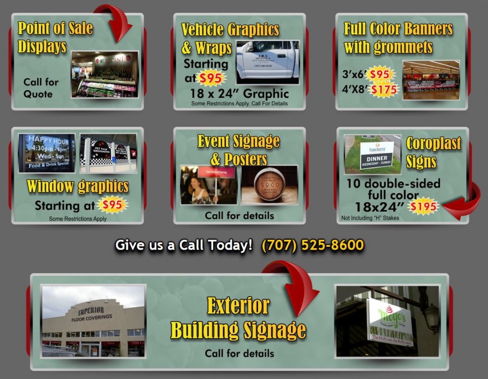
AJ Printing & Graphics and Wine Country Signs is a commercial printer in Santa Rosa, California specializing in digital and offset printing as large format printing. We put our relationships with our clients over everything in order to ensure their success. With over 30 years’ experience in the industry, leave the printing to us and focus on other things. We are a green business, recycling all of our paper and buying from trusted businesses that commit to the sustainability of our planet. We are your partner in print, design and marketing located at 1315 North Dutton Ave Santa Rosa, CA (707) 525-8600!